by Nick
Posted on 01 September, 2016
This week I attended a workshop at the CDC about last year’s FluSight challenge, a competition that scores weekly real-time predictions about the course of the influenza season. They are planning another round this year and are hoping to increase the number of teams particiating. Stay tuned to this site for more info.
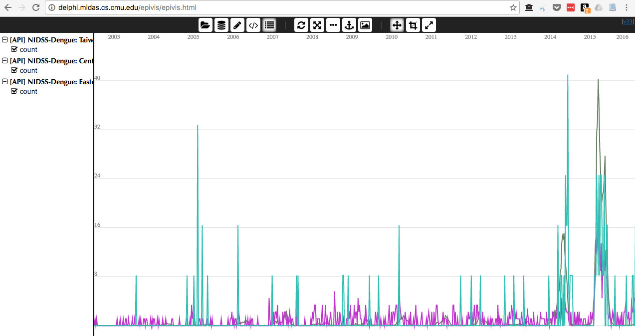
At the workshop, I learned about DELPHI’s real-time epidemiological data API. The API is linked to various data sources on influenza and dengue, including US CDC flu data, Google Flu Trends, and Wikipedia data. There is some documentation and minimal examples, and this post documents a more robust and complete example for using the API via R. I’ll note that the CDC’s influenza data, can also be accessed via the cdcfluview R package, which I’m not going to discuss here and I will focus here on accessing some of the other data sources. Here’s a teaser of this data that you can also interactively explore on the DELPHI EpiVis website:
Let’s start by loading the R script containing the relevant methods needed to access the API.
source("https://raw.githubusercontent.com/undefx/delphi-epidata/master/code/delphi_epidata.R")
Then, load in two packages that we will use to tidy and plot the data.
library(MMWRweek)
library(ggplot2)
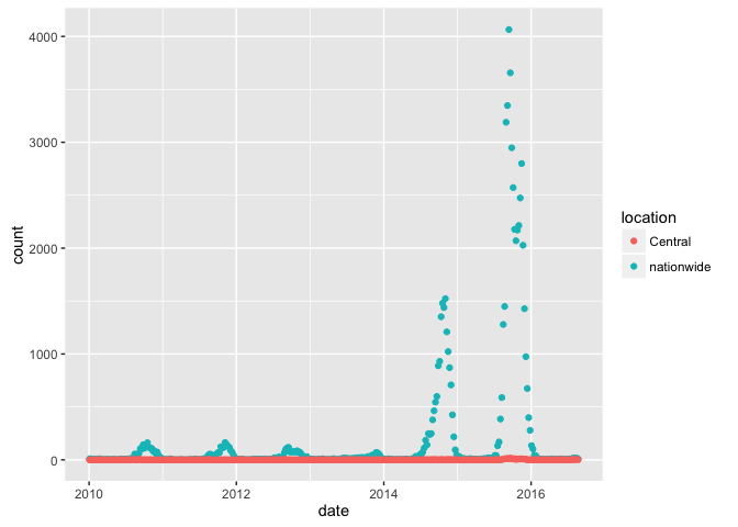
Here is some code that pulls data from Taiwan’s NIDSS, specifically asking for nationwide data, and data from the central region. A complete list of regions and locations are available. Also, I’ve specified a range of weeks from the first week of 2010 (201001) to the last week of 2016 (201653).
res <- Epidata$nidss.dengue(locations = list('nationwide', 'central'),
                            epiweeks = list(Epidata$range(201001, 201653)))
The above command should pull data down into your current session, but it will be a little bit ‘list-y’, so here is some code I wrote to clean it up and make it a bit more of a workable dataset in R.
df <- data.frame(matrix(unlist(res$epidata), nrow=length(res$epidata), byrow=T))
colnames(df) <- names(res$epidata[[1]])[!is.null(res$epidata[[1]])]
df$count <- as.numeric(as.character(df$count))
df$year <- as.numeric(substr(df$epiweek, 0, 4))
df$week <- as.numeric(substr(df$epiweek, 5, 6))
df$date <- MMWRweek2Date(MMWRyear = df$year, MMWRweek = df$week)
Note the use of the MMWRweek2Date() function that gives us a date column in our data frame. And here is a plot of the resulting data.
ggplot(df, aes(x=date, y=count, color=location)) + geom_point() + scale_y_log10()
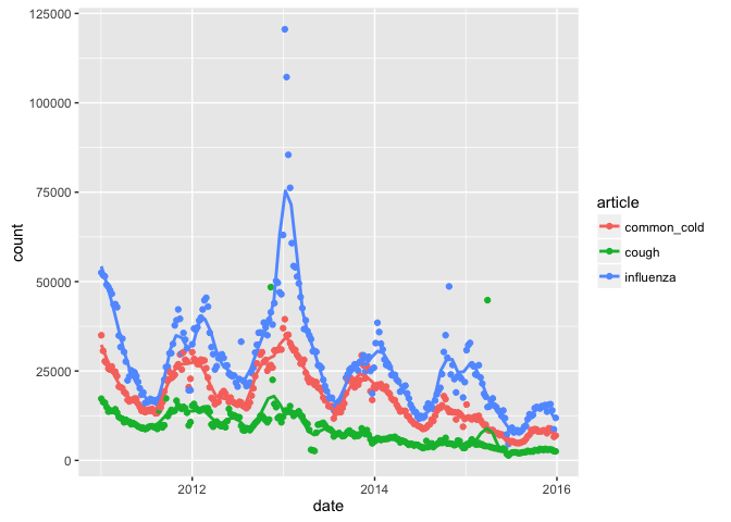
Let’s try loading some of the Wikipedia data on influenza and other related terms. The article. I think this reflects the number of hits on pages of certain articles, although I’m not sure.
res <- Epidata$wiki(articles=list("influenza", "common_cold", "cough"),
                    epiweeks=list(Epidata$range(201101, 201553)))
df <- data.frame(matrix(unlist(res$epidata), nrow=length(res$epidata), byrow=T))
colnames(df) <- names(res$epidata[[1]])[!is.null(res$epidata[[1]])]
df$count <- as.numeric(as.character(df$count))
df$year <- as.numeric(substr(df$epiweek, 0, 4))
df$week <- as.numeric(substr(df$epiweek, 5, 6))
df$date <- MMWRweek2Date(MMWRyear = df$year, MMWRweek = df$week)
ggplot(df, aes(x=date, y=count, color=article)) +
  geom_point() +
  geom_smooth(span=.1, se=FALSE)
Happy data exploring!
UPDATE: (2 Sept 2016) Roni Rosenfeld, the head of the DELPHI group at CMU, pointed out and asked me to mention that David Farrow was the force behind the creation of the epidata API and the epivis tool.