by Nick
Posted on 04 April, 2016
Another Five College ASA DataFest has long come and gone, and I’ve been meaning to write a recap for a while. Now in its third year in the Pioneer Valley in Western Massachusetts, the number of registrants doubled from last year, from 70 to 140. All Five Colleges (Amherst, Hampshire, Mt. Holyoke, Smith, and UMass-Amherst) sent multiple teams, and there were a few teams with a mix of students from different schools.
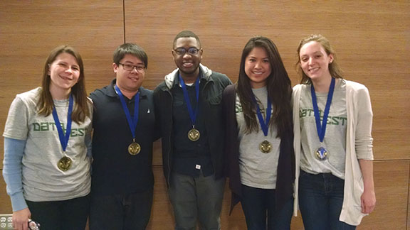
Team “Beta than U” from UMass-Amherst took home one of the Best in Group awards. From left to right: Laura Bowles, Vincent Lee, Harley Jean, Bianca Agustin, and Stephanie Crowley.
From UMass participants alone, the academic departmental diversity was striking: I recorded 17 distinct majors represented from the registration list. They were Computer Science, Public Health, Finance, Applied Math, Economics, Mathematics, Statistics, Biology, Kinesiology, Biochemistry, Sports Management, Informatics/Data Science, Chemistry, Operations and Information Management, Actuarial Science, Linguistics, and Mechanical Engineering. The largest number of students came from Computer Science (not a big surprise considering it is one of the data-science oriented biggest majors on campus).
Despite it all happening now over three months ago, I made a few notes during the presentation sessions about some simple tips that I thought could dramatically improve the group presentations, ranging from the technical to the conceptual.
Lesson 1: Make sure you use big fonts for the images in your presentation. I think at least half of the presentations displayed images that even when displayed on the massively large auditorium screens in the Integrated Sciences Building, were completely illegible. I’ve documented a simple but piecemal way to make the graphics better one at a time using Rpresentations (which a lot of folks were using). I’d love to have someone show me how to integrate this into a “theme”, so that it could be included only at the top of the file. But this seemed like a massive rabbit hole to fall down to understand how the Rpres output actually allocates real-estate. The whole point is to have this be simple and relatively easy. Bottom line: make sure your graphics will look good when displayed on a large screen!
Lesson 2: Tell a simple story. The best presentations in my opinion were the ones that focused on a simple narrative and supported it with a few key (and legible!) graphics. Overly complex answers to complex questions are hard to explain in your 3-5 minute presentation slot. I encouraged teams throughout the weekend to spend time testing out simple questions and stories. It’s always a balacing act between figuring out the simple, answerable question and wrangling with the data. But without the simple question it’s easy to get sidetracked into non-essential data cleaning tasks.
Lesson 3: Be original. Because the data for the DataFests tend to be corporate (at least they have been the past few years), there is this tendency to follow the formal guidelines and think like a data scientist whose been hired by a marketing team. It’s quite possibly an interesting question to ask how the company could try to maximize profits by creating targeted marketing strategies based on say search queries or geographical location. But it’d be a valid (and creative!) approach to come at these datasets from the perspective of a data scientist consumer advocate. Could you give information to consumers that could help them make better decisions for themselves? Tips on finding good deals or seeing market inefficiencies? Yes, part of DataFest certainly incentivizes “best business insight” but it’s important to come at these problems not just as a corporate data scientist, but as a human one too.
I look forward to seeing the data science wizardry in upcoming iterations of DataFest. As always, hats off to the folks who made it happen this year (Ben and Amelia in particular).